The psychology of colour: Choosing the right palette for your office design
- Carl Brown
- Design Trends, General, Office fit out, Office Fitting
Colour is a powerful tool that can influence our emotions, behaviours, and even productivity. When it comes to your office design, choosing the right colour palette is essential for creating an environment that fosters creativity, collaboration, and productivity. In this blog post, we will explore the psychology of colours in the workplace and provide guidance on selecting the best colour scheme for different office settings.
Understanding the Psychology of Colours
Colours have the ability to evoke specific emotions and moods. Here are some commonly used colours in office spaces and their psychological effects:
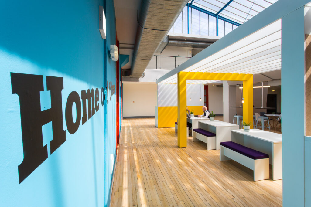
Blue: Known for its calming and soothing properties, blue is often associated with productivity and focus. It can help reduce stress levels and promote a sense of tranquillity, making it an ideal colour choice for tasks that require concentration, such as desk areas or meeting rooms.
Green: Symbolising nature and growth, green is often associated with feelings of balance, freshness, and rejuvenation. It can help reduce eye strain and stimulate creativity, making it a great choice for creative workspaces or areas where brainstorming and ideation take place.
Yellow: Representing energy and optimism, yellow is a vibrant colour that can stimulate enthusiasm and creativity. It can be used as an accent colour in areas where energy and inspiration are needed, such as collaborative spaces or breakout areas.
Neutral Colours: Colours such as white, grey, and beige are often used as base colours in office spaces. These neutral colours provide a clean and professional backdrop that can be paired with accent colours to create a balanced and harmonious environment.

Selecting the Right Colour Scheme for Your Office Design
When choosing a colour scheme for your office design, consider the following factors:
Nature of Work: Think about the type of work conducted in each area of your office. For tasks that require focus and concentration, consider using calming colours like blue or green. For areas that foster collaboration and innovation, brighter and energising colours like yellow or red can be used sparingly.
Branding: Consider incorporating your company’s branding colours into the office design. This not only maintains consistency but also reinforces your brand’s identity and values within the workspace.
Lighting: Take into account the natural and artificial lighting in your office space. Colours can appear differently under different lighting conditions, so test how your selected colours look in various types of lighting before making a final decision.
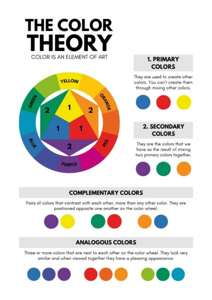
Balance and Contrast: Strive for a harmonious balance between colours, avoiding overwhelming or distracting combinations. Introduce contrast between wall colours, furniture, and décor to create visual interest and delineate different work areas.
Zoning and Wayfinding: Colour can be a practical tool for dividing and organising office spaces. By using different colours in various areas, you can visually separate zones within the office.
Cultural Considerations: Colours can have cultural and regional significance. When designing a global or multicultural office, it’s essential to be mindful of colour choices that may have different meanings in various cultures. What conveys positivity in one culture may carry a different message in another.

The psychology of colour plays a critical role in designing an office environment that promotes productivity and well-being. By understanding the psychological effects of different colours and considering factors such as the nature of work, branding, lighting, employee preferences, and balance, you can select a colour scheme that aligns with your office’s objectives and creates a positive and inspiring workspace for your team. So, let the power of colour transform your office into a space that fuels creativity, collaboration, and success.
We’re here to help you incorporate these powerful psychological factors into your office design

